From past decade we’ve seen that computers are becoming smaller in size and more personal to your life. The age has changed to wearable devices which are sleek and much more connected to your life. Wearable devices are becoming a smart extension to the human body, and that is the success of science and technology. Though there are various tech and non-tech factors playing a vital role in this success, ‘Consistent, Intuitive and Personalized User Experience’ is a crucial one.
Now the question would be – How?
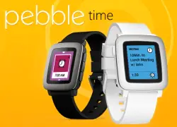
Let’s take an example of the newly launched ‘Pebble-Time’ smart watch. This beautiful smart watch has created an own space in the community and has also generated $20 million of Kickstarter funding, becoming the most-financed project in Kickstarter history. Now the question would be what made it different?
Ergonomic hardware design, color e-paper display providing strong outdoor visibility, iOS & android support, nice collection of watch-faces & watch-apps and long battery life are some of the features which play a key role in the success of Pebble-Time. Along with these success factors, Pebble-Time has simplified users’ lives by making noticeable improvements in the user interface and by introducing a voice-interactivity feature.
USER INTERFACE
Design & Experience wise Pebble has become richer than earlier. In Pebble-Time, every element is designed by keeping a single purpose in mind. Faster animations are being used to draw attention to updates, whereas large and bold fonts are used to show data prominently. Pebble made limited use of colors to enhance the look and feel, indicating states such as temperature in weather apps. Along with the updated version of Pebble SDK, various components or patterns are made available to improve the overall user experience of watch-apps, such as:
- Timeline –
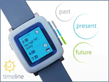
Their newly introduced ‘Timeline’ feature was envisioned to simplify the experience and to make it personal to the user. Timeline basically organizes your information by past, present, and future. You can scroll backwards and forwards as per your need, also, by just tapping the Pebble-Time’s built-in physical buttons in time to see running updates of your life – from recent past to the near future. This feature not only simplifies user lives by tracking the important events in their days, but also provides great opportunity for developers to create applications that push pins directly to their users’ Pebbles. There can be a variety of reasons for Pebble users to use the timeline feature in their day-to-day life.
- Card Pattern –
This style mainly aims to reduce unnecessary levels to access information. Instead of having a number of menu levels to select relevant information, single window is designed that displays an entire data set. Weather app shows data in a single window for each location and can be a good example to understand this pattern.
- ActionBar Layer –
This component is very useful when there are few main actions to complete with a press of a button. ‘ActionBar’ is a layer on the right edge of the window. This layer contains up to 3 icons, each corresponding with one of the physical buttons on the right side of the watch. Music app can be a good example, where the user may use icon buttons to skip current tracks. Also, more actions can be indicated as displaying icon of ellipses.
Along with above 3 features, there are many other design patterns are available in Pebble SDK, For example – List Message, Choice Dialog, Pin Entry, etc.
One of the important aspects of improved Pebble experience is – engaging animations. As compared to earlier Pebble smart watches, animations provided with Pebble-time are not just soothing to the eyes, but they are meaningfully designed as well. These animations offer the users an engaging experience with app.
VOICE INTERACTIVITY
World is changing rapidly and people are now used to accept changes happening with technology on a regular basis. To communicate with others, technology has been experimented with lots of communication apps which include – SMS, WhatsApp, Call, E-Mail, etc. There was no stopping to this invention; Pebble Time had more to offer with its voice interactivity feature.
Thus voice interactivity through microphone is becoming a popular way to communicate with devices to perform actions, as when you’re driving or when you simply don’t feel like texting etc. It’s really easy, fast, and immediate than anything else.
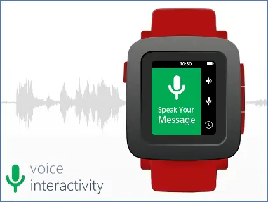
Therefore, Pebble Time has introduced with a microphone option, unlocking the horizons for the wearable device industry. Voice Interactivity allows the user to send voice replies to messages or make short voice notes in Pebble-Time. User can use this for launching an app or searching the web too. Though this feature is currently more limited to android apps, Pebble has definitely created hopes for easy voice communication with iOS in future.
The whole Pebble-Time experience itself is designed with keeping simplicity, reliability and comfort of people in mind. Making use of the above mentioned UI components and amazing microphone feature, anyone can develop user intuitive & useful apps to make people lives easier & comfortable.
Harbinger Systems hosted a live webinar ” Pebble Time, Twilio and the Importance of Voice Communication” on July 22, 2015. Attendees got insights on how to implement voice connectivity in a wearable device along with an interesting live demo of a sample app.
You can view the presentation and the webinar video here


