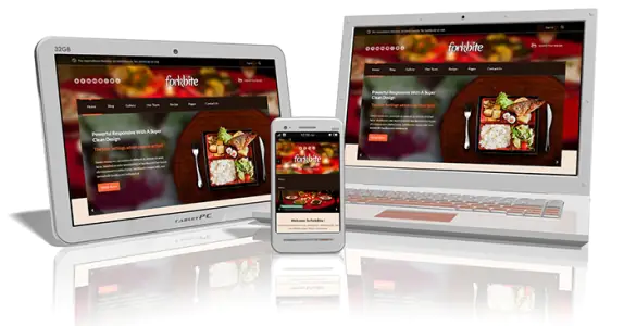
Over the last few years, there has been a huge increase in the amount of people switching from PCs to tablets and mobile devices for browsing the Internet. The report from comscore stated that mobile users in the US are spending more time on their mobile phones than a computer for accessing the internet.
Organizations and businesses need to follow this upcoming trend and establish mobile as one of their primary engagement points for customers and employees.
Currently, mobile functionality can be implemented broadly in two ways:
- Mobile Apps: Native apps deliver content in an engaging way to the user. However, as the name suggests, native app development is platform specific and can be time consuming, also, one needs to consider the device capabilities.
- Mobile Web sites: Mobile websites can be redesigned according to existing site to support responsive UI. Developing a native app has its own advantages which include freedom from device specific capabilities and platform specific restrictions.

Mobile sites usually provide basic functionalities when compared with full-fledged desktop sites. One approach used widely to provide desktop behavior on mobile is by displaying the desktop site link on the mobile browser. This attempt to provide desktop features on a mobile device turns out to be a horrifying user experience. The reason for a negative experience is because mobile users want simple and easy to use website interface with apt options. Hence, it is better to serve full site functionality to everybody including mobile users.
When we consider the missing features from mobile when compared to desktop, the following aspects come to the mind:
- Performance – slow page load in mobile browser
- Accessibility – excessive horizontal scrolling restricts user navigation
- Compatibility – desktop version on mobile browsers doesn’t have desired behavior
- User Experience – zooming in for viewing content degrades user experience
The question thus arises is: How to replicate desktop features on a mobile device– without compromising on any of the above mentioned areas?
Below are some key factors to be considered while designing desktop features on mobile:
- Network Availability considerations to get better Performance
As compared to desktop, a mobile device has potentially slower internet connection speed. As a result, your website can consume lot of time to load, which is very frustrating for the user. For loading of web pages there needs to be a check on of the type of graphics used for the website. It helps in quickly loading of the webpage on slow mobile internet connections. - Natural Eye Navigation flow supports Accessibility
On desktop web sites, horizontal navigation flow is a widely accepted way of structuring and presenting the content. However, we should not test the user’s patience by making him scroll horizontally on his mobile device. Instead, the content flow should be directed in a vertical manner. - Different Platform support
There is a wide range of smart phones available in the electronic market. Android has more than a dozen of screen resolutions, each with different pixel intensities. iOS has also joined the bandwagon after the release of retina powered iPhone 5. One should be aware of how their UI functions and ensure that it is compatible with major platforms and devices used by their consumers. - Optimal Real Estate usage for better User Experience
Websites developed for desktops usually have 1024 x 768 screen resolution. With varying resolutions and sizes of mobile devices, one needs to offer the same viewing experience to users irrespective of the device used by them to access your website. Here are some more points to consider for mobile development:
- Fixed width does not work. Most of the mobile screens prefer fluid width.
- Each device can have different screen resolution, aspect ratio and browser behavior
- Flash is on the verge of being extinct. So the content displayed in flash needs to be migrated to more mobile friendly technologies
- Skip native controls for custom-UI widgets for achieving optimized design and complete control over inputs
- Easy-to-read icons and options
- User friendly navigation and menu
- One-touch information should be preferred
With the right use of frameworks, platforms, technologies and designs, a business would be able to engage its consumers on their mobile site and provide an interactive experience. However, before developing a website for desktop or mobile device, one should understand the complexities and differences involved. The design and functioning of the website will mainly depend on the platform it will be used.


