When it comes to decision making in businesses in this highly consumer-focused era; analyzing the data is inevitable. It helps to take appropriate decisions for the organization as well as the customers/consumers. However, data analysis can be a very cumbersome task if it is not collected, managed, and presented correctly. Moreover, cleaning, inspecting, transforming, and modeling the data to discover useful information via traditional ways can be heavily time-consuming and that too with fewer insights.
To overcome these challenges and to adopt a technique that provides explicit insights from the data for taking best decisions; organizations are moving to using dashboards.
A dashboard can be referred as a visual representation of the current and past status trends of an organization’s KPIs, modules, functions, sections, and measures. It gives a quick and easy way to view the information in real-time. Visibility, extant improvements and deteriorations, time saving and the ability to judge performance against the plan are some of the key benefits of using dashboards.
In this blog, I’ll focus on few important points that need to be validated while designing the dashboard. They are as follows –
- Know your Key Performance Indicators (KPIs): KPI (Key Performance Indicator) is a measurable value of success/failure through which user gets an idea about the various performing parameters. Knowing your KPIs is the key to creating a dashboard that your users will love to interact with. This will help users to decide the next immediate step and enable them to take next necessary action.
- Try to keep everything simple & straight: Simple things are the best ones to digest and recall quickly. Don’t mess the dashboard with complex information. Try to break complex information into simple chunks as it helps your users to reduce the cognitive load and consume the information quickly.

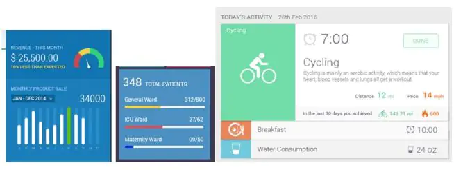
In all the above 3 dashboard examples, information is displayed in a straightforward and in a simple manner. The first example shows a speedometer to show the income, second shows patient distribution and third shows the activity that user has performed with details.
- Know the platform for which you are designing: Knowing the platform will help you to design the dashboard in a simplified manner. Whether it’s a smartphone, tablet, full resolution monitor or combination of all? The answer to this question will have significant changes to your design and interactions.
- Take into consideration your audience views: Instead of guessing and assuming about what users will find necessary and valuable; reach out to them to find out what exactly they want. This can be done by conducting user interviews, general polls, exploring the domain and secondary research. These results will help to prioritize the data and decide on the display mechanism. (Whether to go for KPI or graph)
- Give a holistic view, but provide option to drill down: A dashboard is all about providing a holistic view of all the functions/modules, but some might be interested in digging deeper and getting to a particular level.. Keep an option to drill down wherever possible up to a specific level for such users. Giving this privilege will facilitate both types of users – holistic and drill down type.
- Make it customizable: Customization will solve the problem of knowing the user base. It helps users to get the feeling of being connected with the interface and get private space. This ability to customize will expand the number of users for whom the dashboard appeals.

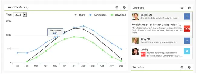
The above dashboard example has a settings icon for every widget which facilitates customization of options for viewing the data as well as dragging and changing the position according to user’s choice.
- Do not overload: Showing too many objects on a dashboard will confuse the users rather than helping them. Design apt objects as being selective will help to display and consume information in an easy and in a user-friendly manner.
- Provide help and feedback: Ready help and tutorials about how to utilize the dashboard will facilitate the users to digest the dashboard in a better way. Brief first-time tutorials will help the users to understand the interactions and widgets’ significance. Feedback from users will enable you to address issues arising in accessing valuable information, a must for every dashboard developer.
Summing it up, these were some of the key points that you need to consider while drafting the dashboard.
Web dashboards can provide users the detailed information whereas for smart devices, it can be customized to suit the requirements on the go.
At Harbinger, we have developed a variety of dashboards such as completely data driven, dashboard with quick glimpse of KPIs, dashboards including data tables, etc, on several platforms. While creating/designing these, every dashboard is ideated & evolves around the above-mentioned best practices. We know and understand that users have a shorter attention span, and they love things that are simple and easy to control. Harbinger employs user-centric design and lean UX methodologies to deliver a product with rich user experience and suitable for the users’ needs.


