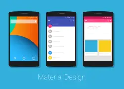
Google launched the Android Lollipop aka Android L, a mobile operation system for Android phones couple of months back. One of the major updates in this version was “Material UI”. As part of our team’s culture in learning and implementing new emerging technologies/methods, we showcased various visuals of this new design style. It was noted that users found it difficult to figure out and appreciate the differences in the new Material UI design.
This observation was validated upon my discussion with many peers and with this blog talk about how the difference Material UI has brought and its benefits.
‘Material’ – New Visual Language by Google
In recent past, technology giants like Google, Apple & Microsoft have moved away from skeuomorphic design and introduced a minimalist and flattered visual design language. Although, Apple and Microsoft have different names for their styles, both revolve around the notion of ‘FLAT DESIGN’. Material borrows principles from flat design; however its outcome is quite different than flat.
Principles of Material UI
Material Design is not just a design style; it’s a metaphor which is a unifying theory of rationalized space and a system of motion. Material is grounded in tactile reality, inspired by the concept of paper and ink, yet technologically advanced and highly flexible. This is a visual language that adheres to the classic principles of good designs and allows the intrusion of advanced technology and science to simplify it to next level. Material provides greater flexibility to create superb affordances without breaking the rules of physics.
With Material Design, Google has provided the solution to major affordance issue of Microsoft & Apple’s ‘FLAT DESIGN’ concept. They acknowledged the human’s superb ability to recognize depth and perceive information hierarchies organized in ‘z-axis’. Hence, in Material every element is having x, y and z-axis; which generates a three-dimensional environment but in a subtle way. Also, it creates a wonderful illusion of layers placed one above the other.
This language is bold, graphical and more intentional. It makes the perfect use of subtle light, surface and motion to convey how objects move, interact and relate with others. Exactly like print media, this language creates a hierarchy, meaning and focus through typography, grids, space, scale, color and beautiful use of imagery.
In Material, all interactions initiate through meaningful motion. Primary actions of a user work as a touch point which initiates motions that transform the whole design. As all actions take place in a single environment, the user never gets the feel of switching between multiple screens. Interactions with motion don’t break the continuous experience while providing focused attention throughout.
Google recommends designers to take some of the basic Material UI principles and design towards a new direction with their own creativity.
Benefits of Using Material UI
- Provides a unified experience across platforms and device sizes with responsive UI
- Supports touch, voice, mouse and keyboard as first-class input methods
- Improves usability through appropriate visual clues and meaningful motion
- Creates delightful experience through interactions along with motion
- Increases the importance of primary action with a floating action button
- Varieties of controls are instantly available to use (e.g. Dropdown, Bottom Sheet and Chips, etc.)
- Supports Bi-directionality (RTL languages like Arabic, Hebrew, and Persian)
- Provides accessibility to people with various kinds of disabilities
Have Extended Scope, But Still Soundless
Google has not just brought a new language for interface design; it has also extended the scope of innovation with the help of technology. However, because of some existing problems persisting with Android OS, Material’s effectiveness could be limited than expected. Also, Google allows phone manufacturing companies to apply their own skins on android OS without making much difference to the consistent look & behavior.
Another reason could be – Mobile developers still prefer to develop iOS app first and then adopt it later for Android with minor tweaks in the user interface to match with OS guidelines. Though Material provides opportunities to develop complex and intuitive interaction flows, UI development for android takes more time & efforts when compared to iOS.
To know more about Material design, it’s properties, new features, widgets and the best practices to be followed while developing using Material design, Click Here.


